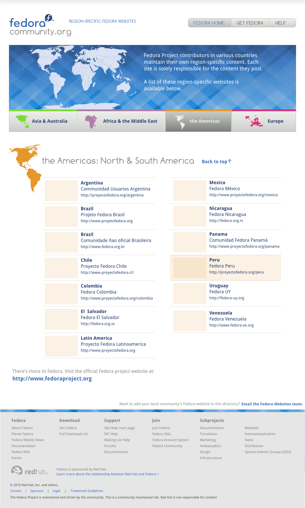
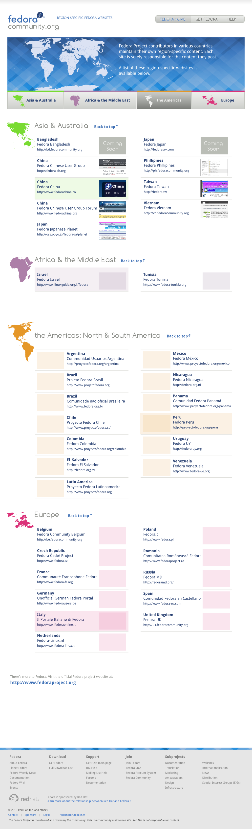
The vision for fedoracommunity.org
Fedora has a lot of local community websites. A somewhat recent addition to the mix is Fedora’s local community domain program, whereby a local Fedora community can obtain a *.fedoracommunity.org domain to point to their self-hosted website.
In the midst of a thread on the advisory-board mailing list, it became clear that it would be a good thing to have a single place where folks seeking out their particular local Fedora community could go to find it, rather than searching in multiple places for their community. In the thread, a Fedora Infrastructure ticket to this end was also referenced.
The work so far
Matt Domsch created the barebones portal page for this directory that is up on fedoracommunity.org now, asking for assistance in making it a nicer-looking site. I posted an initial mockup for feedback in reply, and since then have iterated a few times based on the feedback I’ve gotten. I’ve been working with Sijis Aviles, who very quickly took my early mockups and produced a first cut at an HTML/CSS version of them.
A few design decisions have been made throughout this process that you might want to be aware of:
- Both national flags and national borders can, in a few cases, be quite controversial and stir up hard feelings so we did our best to avoid them in the design.
- The countries have been split up by continent because there are quite a lot to list on one page, and the continent to which a country belongs nor the shape of the continents of the world are not so controversial.
- We’re considering using screenshots of each local site to help users distinguish between different communities that share the same country. Having the screenshots displayed on the screen all at once makes it a little cluttered, so Sijis and I have discussed using something like on-hover popup snapshots instead.
- This design uses the new Comfortaa font that the Fedora Design team is trialing usage of for a new Fedora titling font.
How you can help

- Are you a member of a local Fedora community? Can you take a look at this mockup and let us know if we missed your community site?
- Are you a designer? Got any great ideas for the style and design of this site? Crack open the latest SVG source, which uses the fonts Comfortaa and Droid Sans, and try out your ideas!
- How well do you think Comfortaa works in this design?
- Got any feedback on the site concept and design? Let us know. You can provide feedback through the blog comment system here, but even better, let us know on the Fedora website team list. I’m especially interested to hear feedback from Fedora Ambassadors.

Great Design … From the Marketing & PR point of view we should talk sometimes about it… 🙂
Posted by wonderer | July 19, 2010, 3:19 pmThis look so nice, smooth and professional! And Comfortaa is really a great font choice, it look so good and professional too 🙂
I love it.
Posted by Kris Thomsen | July 19, 2010, 4:00 pmOh snap. I think I’ll have to redesign the Mexican Fedora Website and turn it from a blog of sorts to a more informative page (With how to join, etc), if its to be linked directly from Fedora.
Posted by Nushio | July 19, 2010, 4:02 pmI hope it’s okay and this doesn’t cause you too much stress! You can most certainly feel free to use any of the designs, CSS/HTML, etc we create for this on the Mexican Fedora site!
Posted by mairin | July 21, 2010, 3:50 pmDefinitely looks awesome
The site of our community in Mexico needs a lot of tinkering and maintenance,
could do with a redesign (currently it’s only a hosted WordPress blog).
Of course, I’d be happy to help.
Greetings.
Posted by Pacheko | July 19, 2010, 6:35 pmThanks Pacheko!!!!
Posted by mairin | July 21, 2010, 3:51 pmGreat job! Tumbs up!
Posted by nelson | July 20, 2010, 11:04 amI would suggest a different order of those region buttons. They seem very confusing to me presently. I would expect them in the same order as the regions are in the map above. That means “Americas -> Europe -> Africa -> Asia”. Maybe Africa and Europe swapped, that doesn’t matter, even though the first order is more expected by visitors.
I don’t want to have them sorted by “importance” or whatnot. But the order should follow some pattern (and I haven’t found one in current order). Button order following map order seem reasonable (and intuitive) for me.
Posted by Kamil Páral | July 21, 2010, 3:49 amHi Kamil!!! Great catch! I actually meant for them to be in alphabetical order (it seemed fairest), but I started switching which colors were used for which country and I think I set them out-of-order. Whoops. And I totally missed it. I like your idea of listing them in order of the map. Actually, Remy even suggested having the full world map at the top clickable as well, which I think would also make it easier to navigate.
Thanks for the great idea, we’ll most certainly update the design to include it!
Posted by mairin | July 21, 2010, 3:53 pmwow, nice design , really link the 4 tabs , on mouse over you should make them look like land ( green and off the page a bit ) Great work!
Posted by Wesite Design Firm | July 21, 2010, 5:40 pmThis looks beautiful. I think will help to make more visible local web sites. Thank you.
Posted by Neville A. Cross | July 23, 2010, 4:45 pmIt looks too “enterprisey”.
Posted by Giovanni | July 24, 2010, 6:28 pmHi Giovanni, is it an issue? What specific parts are the biggest problem do you think? Do you know of any examples of a style that would be more suited?
Posted by mairin | August 2, 2010, 12:56 pmThis looks beautiful!
Posted by Ypho | July 30, 2010, 3:38 am