So about a month ago I blogged a preview of the Fedora 14 theme, which was designed fo Fedora 14 Alpha. Based on your feedback (mostly that the initial wallpaper was too dark), Kyle Baker came up with a modified version of the wallpaper that is much lighter in color:
Kyle B

Since then, Federico Cáceres, a new member to the Fedora Design team, has put together some iterations on Kyle’s latest iteration:
Federico A

Federico B
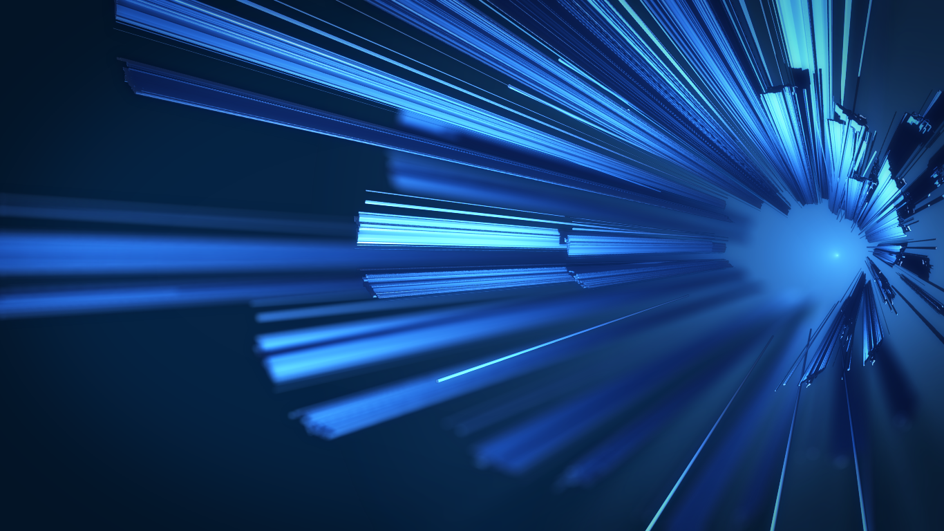
Federico C

You can also find them on the Fedora project wiki’s F14 Artwork page.
Time is running short for us to iterate this wallpaper for Fedora 14 Beta! Want to try your hand? All of the sources are available, and it’s a great excuse to try out Blender if you haven’t gotten a chance to yet. 🙂 Not up for working on the design, but have some feedback you’d like to share? Join the conversation on the design-team mailing list, or drop your feedback in the wiki or in this blog post’s comments.

Federico B is my favourite. 😉
Posted by Tommy He | August 16, 2010, 6:06 pmPlease get rid of this aweful wallpaper as long as it is still time… it does not work as a background.
Posted by Michael | August 16, 2010, 6:07 pmWhat don’t you like about it?
Posted by mairin | August 16, 2010, 7:59 pmFor me it its a bit jarring visually. The texture of the background doesn’t mesh with the foreground extrusions. The extrusions themselves feel like psuedo-3d but then back up into the fuzzy light source which feels like a matt painting background. Its like I feel like part of the image wants me to believe the focal length of the camera is quite long with a deep field of focus..but then the background is telling me the focal length is shorter with a tighter field of focus…jarring. Its sort of like the feeling I get when I watch the digital characters interactiing with real characters in StarWars Episode 1…but different.
Out of all them the first one feels less jarring and is reminiscent of ice crystals on a glass surface and less like 3-d extrusions. I would encourage the interpretation of the original towards that end… a crystal lattice film on glass in in sharp focus in the foreground in from of some diffuse out-of-focus background at some distance. A photo realistic macro photo with a tight focal point and a short focal length. Bonus points if you can bring in a white light source from the side like a contrast imaging microscope and introduce color via internal reflections and diffractions of the light in the boundaries of the crystal lattice structures.
-jef
Posted by Jef Spaleta | August 16, 2010, 8:27 pmlooking at the again. I’d say Federico C is the less jarring of the three newer versions.
In fact if you could some how make a smoother transition between the diffuse light source and the more rectangular structures it would fix it to my eye. Sorry I can’t be more specific than that. The straight edges are still to sharp to my eye in some places.
Also the smaller images in your blog seem to have a completely different colorscape than the large images you link to. The large images are more purple in tone. Weird.
-jef
Posted by Jef Spaleta | August 16, 2010, 11:02 pmI don’t like any of these either. It feels like more broken glass about to pierce me from the desktop which is not good imagery. The lighting is sort of scary, dark and overall it doesn’t blend with anything. It doesn’t evoke any good emotions.
Posted by Rahul Sundaram | August 16, 2010, 8:39 pmNow Rahul, you could have spoken up a lot sooner. 😦 This is very depressing, I didn’t hear this kind of negative feedback at all when I posted this and we had weeks of time. Do people not want me to sleep? 😦
Posted by mairin | August 16, 2010, 8:43 pmWasn’t 28th of July early enough ?
http://mso-chronicles.blogspot.com/2010/07/f14-laughling-wallpapers-package.html?showComment=1280304822077#c1699731986563720270
This was as soon as the chosen concept was announced (at least on MSO’s blog).
I didn’t think it was worth repeating my comment on your following blog posts as Martin is somehow a prominent member of the design team (and I’m not sure my input has any value anyway).
Sorry 😦
Posted by bochecha | August 17, 2010, 4:23 amThese are interesting, but I prefer my desktop background to be more subdued and understated, so that any icons placed on it stand out prominently.
Posted by Allen Halsey | August 16, 2010, 8:59 pmUpdate: Actually I’m trying out “Kyle B” and it is starting to grow on me. Icons show up nicely against it. It is more striking that what I usually want in a desktop background, but the change is kind of nice.
My only suggestion is that it feels unfinished in the area of the source of the slivers. They are radiating from nothing, it seems. It needs something there.
+1 on “Kyle B” if the above suggestion is addressed.
Posted by Allen Halsey | August 17, 2010, 2:40 pmI like kyle B the best. The others are to bright for my taste.
@Jef – Don’t hold back brother, tell us how you really feel =P. With all of that I expect to see your version submitted soon.
Posted by tk009 | August 16, 2010, 9:39 pmtk009,
Oh I assure you, nothing I can do is even close in quality of effort and critical feedback is meant constructively and being as specific as possible. I think its inappropriate to do a driveby “meh” comment. If I’m going to have something critical to say I’m going to try to be as specific as possible to give the content creators something to work with if they listen to me. I’m trying to couch my feedback as relative measurements of each of the 4 images against each other not an absolute thumbs up or thumbs down for any of them. The comment about crystals on a microscope slide is as much a personal science geek-out moment as it is serious commentary.
Posted by Jef Spaleta | August 17, 2010, 1:47 amI put two of the images (Kyle B and Federico B) on my netbook with Fedora 12 installed, and found both the images distracting. The aperture pulls my eyes towards it. I don’t know if that would be the same for others, or if I’d get used to it. I just thought I’d give some feedback.
Posted by Landor | August 17, 2010, 2:16 amI like federico b. Is like I’m traveling through a tunnel. It have a well defined first plane and a blurry background with not to bright colors.
Posted by khudsa | August 17, 2010, 5:43 amI like Kyle B very much but the others are much too bright and they miss the necessary contrasts.
Posted by red | August 17, 2010, 8:26 amSomehow, the design reminds me of some kind of Aurora Borealis, for instance:
http://www.astronet.ru/db/xware/msg/1163364
I wonder if it makes sense to blend the lines to achieve a similar effect
Posted by Gianluca Sforna | August 17, 2010, 10:46 amI’ve found one issue (while trying on smaller LCD with smaller resolution) yesterday. KDE by default shows Home Folder View with icons – this Folder View is transparent box and in some position/size it looks like skewed/distorted because of stripes.
After some time I’m using laughlin-backgrounds as default, I really like it as login screen/splash background. It’s really wonderful! But as I found issue above I’m not sure it goes very well with icons/widgets on desktop (I’m not using any…) – could someone try to make the stripes more like light stripes? It could help.
Posted by jreznik | August 17, 2010, 10:58 amI’m sorry Máirín, but I don’t like this wallpaper at all. I have the feeling like something sharp is flying into my eyes, constantly. It’s a very aggressive wallpaper and I wouldn’t be able to work on such desktop even for a few minutes. I have the feeling of constant danger and unease. This wallpaper is attacking its users, unfortunately.
Posted by Kamil Páral | August 18, 2010, 3:48 amOkay, we’ll work on it! 🙂
Posted by mairin | August 18, 2010, 9:07 amI love the C iteration. I still think we need something in the empty spot in the middle of that structure, though. It naturally draws your eye to that spot and then there’s nothing there…
Posted by Fab | August 23, 2010, 4:06 am